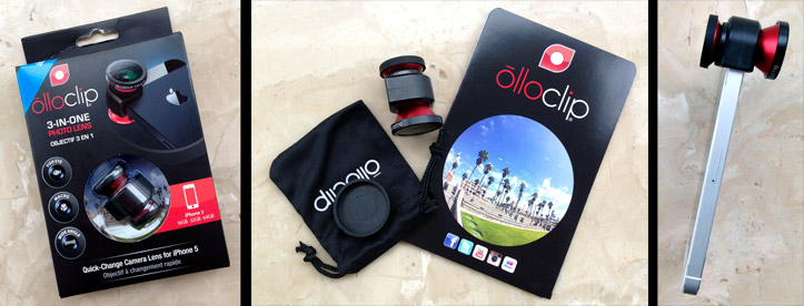
Olloclip – as the website states – is “a quick-connect lens solution for the iPhone that includes fisheye, wide-angle and macro lenses in one small, convenient package that easily fits in your pocket”. Having seen something similar at CES 2012 – the iPro Lens – which seemed promising, I wasn’t too surprised to see something like this for sale in the Apple Store in Shanghai. So, I bought one (¥548 / £59) to try out on my iPhone 5.
Granted, when I say “expensive” in the title, in comparison to any of my “proper” lenses this one really is a bargain – but it is definitely up-there on the accessories pricing scale if it turned out to be just a bit of fun…
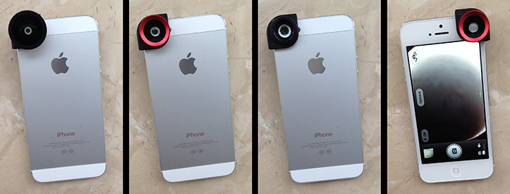
So, after unboxing, here it is in all 3 modes (left to right) : Fisheye, wide-angle, macro – and finally the front view when in fisheye mode.
First impressions? It’s built well with a brushed aluminium casing. It comes in a little “pouch” and has a handy quick-reference guide along with two lens caps (unfortunately the one for the wide-angle side is too large and so continually falls off). If you have any form of case on your iPhone (or even protective film, as I discovered while the lens peeled it off), this won’t work for you – it’s designed be used on an iPhone “commando style” 😉
That’s a good start then – and it fits in your pocket quite neatly too. Clearly, this isn’t designed to be DSLR quality (and never would be) but my expectations were that if I’m going to the effort and expense of bringing this gadget along with me I should be able to get some interesting shots of a reasonable quality. Sadly, after using it for a few hours, I discovered I was wrong…
Here is the Shanghai Pudong skyline, taken from 3 on the Bund’s “New Heights” rooftop terrace. On the surface, clearly, it does as advertised (left to right : standard iPhone, wide-angle lens, fisheye lens). My first frustration actually casts all the way back to when I first opened the box. You see that perfect sphere they show on the manual insude? You know, the signature “fisheye ball” that camera lens manufacturers try to create with amazing glass such as the Canon EF 8-15mm f/4L fisheye? Yeah, forget that. 🙁
Now, I know, this is a tiny lens on a tiny sensor and a fraction of the price of the Canon glass – so why would I expect the perfect sphere? Well, perhaps it’s because that’s what they suggest you can get on all the packaging…? Poor show in my book.
Then we move on to the bigger issue – focus. (Above, again, left to right : standard iPhone, wide-angle, fisheye). On both the wide-angle lens option as well as the fisheye, the focus on anything outside of the centre-point is APPALLING. Again, I know, it’s a little lens on a little sensor, etc etc. But wow – I mean it’s bad. I’ve used the Canon 8-15mm fisheye on a few occasions, and I know the far edges of the image can be a nightmare for lens manufacturers as photographers expect perfection – but this is approaching the realm of being completely unusable.
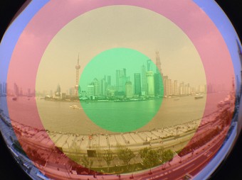
By way of visual representation, I’ve taken the image on the right of the first comparison shot I took and coded the sections in terms of usability:
- Green: Standard iPhone level of in-focus
- Orange: Some blur, could be sharpened to rescue in Photoshop, chromatic aberration creeps in
- Red: Completely unusable, out of focus, chromatic aberration clearly an issue
- Blue: Danger area, if even the tip of your finger is present on the back side of your phone, it will be in the shot
The out-of-focus issue, I was expecting to a certain extent. With a cheap bit of glass in front of a tiny camera sensor, you can kind of predict it’s not going to be perfect – but it really is bad. A fisheye lens does not automatically mean “out of focus at the edges” – something any proper lens will demonstrate. Indeed, this lens actually takes central areas that are in focus with the standard iPhone lens out of focus too. IF this lens created the perfect arty-spheres, I could almost forgive it, but it falls way short of any reasonable expectation in my view. 🙁
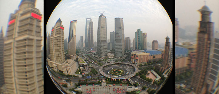
Coupled with this, the blue and magenta fringing on anything other than the very centre really does ruin what should be a reasonable quality shot. The “danger area” issue isn’t really an olloclip problem, in fairness, it’s simply a challenge that the iPhone’s shape (and how it’s held) presents which DSLRs obviously avoid. However, to look at the blur/out-of-focus issue in detail, let’s look at a close-up of the second comparison fisheye shot:
I’ve just expanded the right and left sides of the frame to almost 100% to demonstrate just how far out of focus this thing gets. Granted, the middle section is almost as sharp as the iPhone can get without the lens attachment (and of course, whenever you go through extra glass you dilute quality to a certain extent) but it really is poor. Sadly, the quality of images coming from the wide-angle lens are no better.
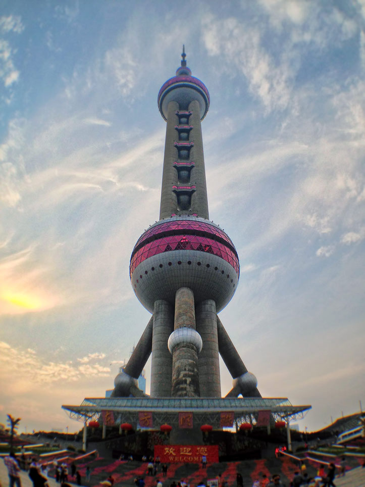
The next shot (from the base of the Oriental Pearl Tower) was taken using the olloclip wide-angle lens attachment.
I haven’t expanded it up like the one above, but trust me, anything other than the central “globe” is extremely blurry and has really strong fringing/chromatic aberration all over. It’s such a shame – I had high hopes for this sort of product. The iPhone 5 actually has a very capable camera inside, and one I use a lot to take pictures when I’m without any of my DSLRs. Sadly, this lens attachment just ruins it.
In the days when people are (clearly) willing to accept “arty” (or in some cases, ruined) Instagram-ified images from their phones, maybe I’m being too much of a purist – but I have a simple way of looking at things when it comes to compact or phone cameras: Get the best optical quality into the JPG, and then let me play with it to my heart’s content. If that means trashing it with overblown effects, that’s ultimately the photographer’s choice – but it’s the camera (and lens) manufacturers’ job to get the best image recorded in the first place. This, of course, isn’t a “proper” lens, by any means – and doesn’t sell itself as such. I just think, with a bit more care and precision they could have made something which I would be happy paying twice the price for, that actually works. Instead, I now have this, which is extremely unlikely to be carried in my pocket in future.
I could argue that the last shot couldn’t be taken by the standard iPhone camera. In theory, very true, but landscape panoramas can be taken with Apple’s own software, and you can “convince” the phone to take them in portrait orientation too. The quality of that would definitely beat what I have delivered by the wide-angle lens attachment. When it comes to the fish-eye mode, granted, there’s something a bit special about the way that style of images can look, but this piece of glass fails to deliver on all counts from what I can see.
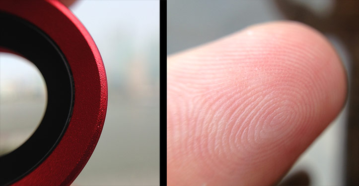
The one function I did find interesting was the macro mode, however…
Interesting, yes – and getting an iPhone to be able to get the level of detail it did from my fingerprint was impressive – but with the way the camera is designed, putting this lens on makes the depth of field justway too shallow. As a result, you really can’t use it to track any form of objects (I tried following an insect) and the way the iPhone itself needs to be held makes it a tough piece of kit for really delicate work.
For me, this is a gadget that could be great, but just falls short. If it was just the extreme edges that were blurry, I’d be more accommodating, but this is an issue from anything outside of the middle 10% of the frame…
I wonder how the “iPro” lens I saw in Vegas compares now it’s been refined. Certainly, on-spec with their own gallery, it seems to be an improvement (at least optically). Sadly, the real world results I’ve seen online from their version suggest it’s just an impossible task to add something to a tiny little camera lens to make it take decent fisheye images that remain in focus. 🙁

