I remember writing this blog post in 2010 as if it were only yesterday. It was about the relaunch of my website after upgrading from an Adobe Flash based system to a more device-friendly one that met a lot more standards on the Internet.
Well, 4 years fly by and since then a lot has changed. HTML5 is now prolific, as are the demands of 3G/4G connections and devices instead of desktop, broadband, viewers. More importantly, however, is the wide-scale adoption of high density displays (or, as Apple have coined, “Retina” screens) in phones, tablets, iPads and now even 5k desktop displays.
So, it’s with pleasure that the “under maintenance” page has now been removed to reveal the brand new PaulReiffer.com 🙂

What’s inside? Well, a lot of the content remains (blog posts, for example), but aside from that pretty much everything has been rebuilt from the ground up. (Yes, that was a lot of work!)
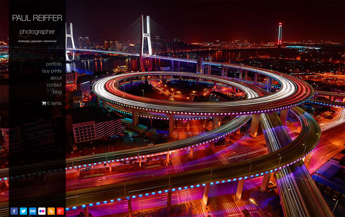
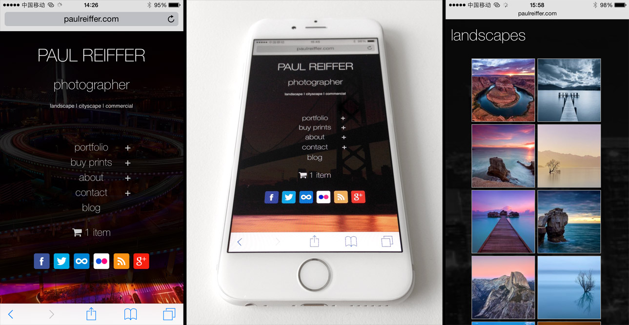
We now have a browsing experience that scales, from tiny non-retina phone displays all the way up to the latest iMac with its monster resolution. The styling is now more modern, clean, and clear. All of our site imagery has been rebuilt with higher quality images (well, you’re here to look at photographs, right?!) and they’ve gone from 723 pixels wide to 1680 pixels wide (and actually up to 3,360 pixels wide on a hi-density display!). “Buy prints” has been re-built with a new, flatter, shopping cart system (as in the screen above) that sits on the menu bar and the portfolios section now shows images that will fill the screen of whatever device you choose to use.

All that’s great (and I’m very proud of the new site), but the key driver for the upgrade was to make the site “responsive”. So, that’s exactly what’s been done. As the site scales, from big to small desktops, to tablets, to phones, to any device actually – the content now changes and adapts to the appropriate size and layout. No more zooming, scrolling, hunting for content around the desktop page on a tiny phone screen – it’s all been made a lot more fancy and clever!

There’s still a lot more to do behind the scenes, but hopefully the fresh new look is something that you guys will like. It’s been quite a long time in the making (and the geek in me is upset that the site had to go offline for a while to do the “switchover”) but hey, it’s done now.
The old site lasted me for 4 years, through thick and thin. Here’s to the next 4 with even more images and stuff to see! 🙂